Qannas App
Qannas App
Fintech Company
Fintech Company
Role
Tools
Duration
Overview
UX Researcher
UX/UI Designer
Figma
3 months
During my internship as a UX Designer at Qannas, I worked on enhancing the usability of a fintech platform designed to help users manage investments, connect with other investors, and track financial portfolios—all within one ecosystem.
I collaborated with cross-functional teams across UX research, design handoff to developers, and marketing to align design decisions with both user needs and business goals.
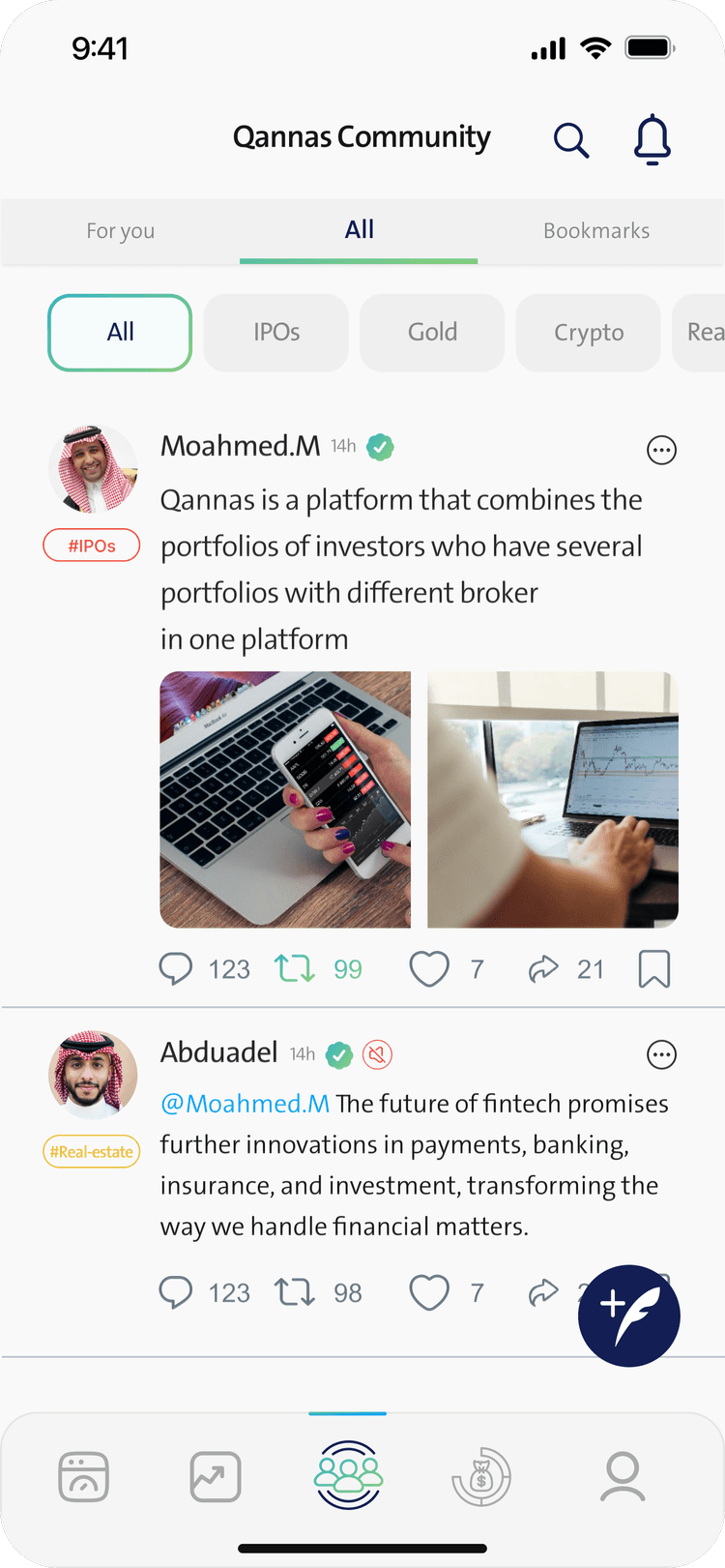
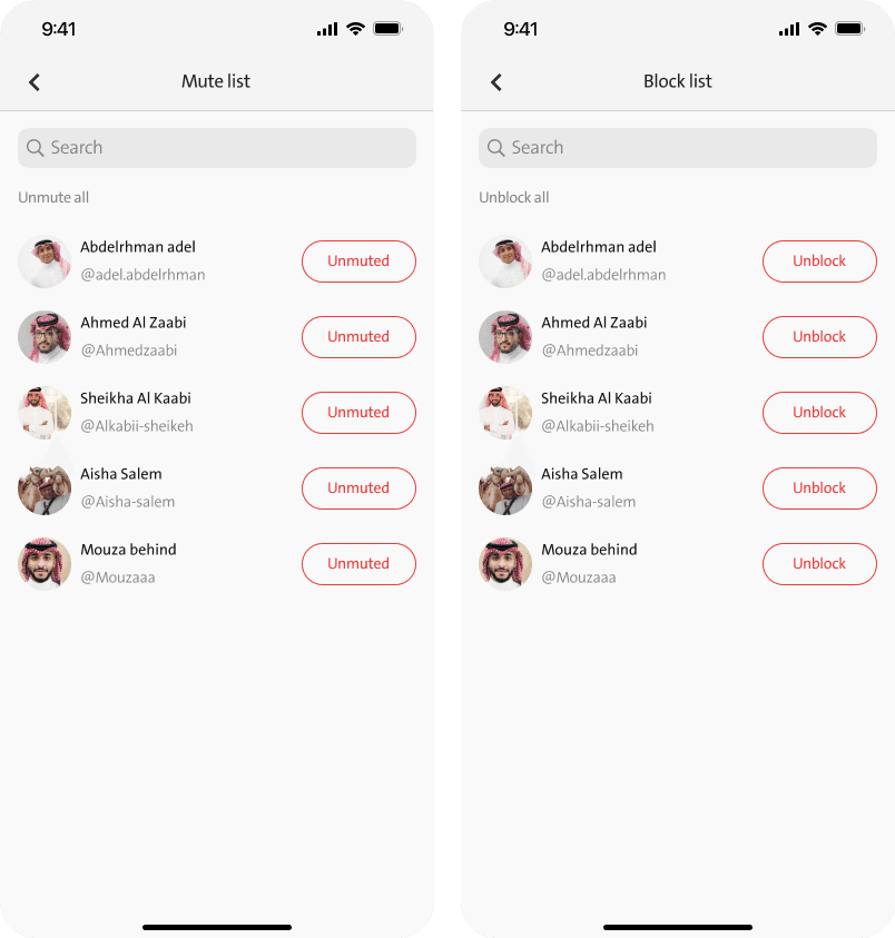
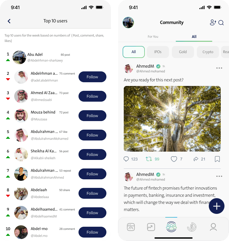
Confusing tab bar icons.
Overlapping elements in community profile and settings.
Users unsure where to edit personal vs. community-specific information.
Confusing tab bar icons.
Overlapping elements in community profile and settings.
Users unsure where to edit personal vs. community-specific information.
Before
Before
A sidebar in the Community section for accessing and editing community profile info.
Clear separation between application-wide settings and community features.
Refined visual indicators for icons and page headers.
A sidebar in the Community section for accessing and editing community profile info.
Clear separation between application-wide settings and community features.
Refined visual indicators for icons and page headers.
After
After

Intefraces
Intefraces
Thank you for sticking around!
Thank you for sticking around!
Challenge
Users were facing confusion between the Settings page and the Profile section, particularly within the app’s community-focused features. The two areas had overlapping functionalities and inconsistent navigation patterns, leading to an unclear user experience.
Users were facing confusion between the Settings page and the Profile section, particularly within the app’s community-focused features. The two areas had overlapping functionalities and inconsistent navigation patterns, leading to an unclear user experience.
Solution
Separation of Profile and Settings – Created distinct pages with clear purposes.
Profile Editing in Community – Moved bio and image editing to the Community section.
Settings Icon in Tab Bar – Replaced Profile icon to better reflect app functionality priorities.